Theatre Posters: Cohesive vs. Unique vs. Uniform
There’s a lot more to theatre posters than just advertising your upcoming show. Let’s do some overthinking!
In this blog post, I’m going to breakdown three distinct styles of theatre posters that I have seen out in the wild— well, the professional world. Unfortunately, there are many theatre companies out there that don’t put much attention to detail when it comes to advertising their shows. Think about it though, your theatre poster is your audience’s FIRST impression of what you are going to be presenting. It has to entice the audience to look into buying a ticket, or at the very least checking your theatre company out.
The three distinct styles I’ve identified can be whittled down to COHESIVE vs. UNIQUE vs. UNIFORM. Allow me to define each one in my own unique terminology— what they mean to me, at least.
Oh, and before I forget, please note that on the following examples, I only included the theatre’s logos and decided to omit details like a phone number, website, dates and times, sponsors, etc. It would all be fabricated anyway. To save time, and to make my point in a clearer fashion, I decided to keep it simple (stupid).
Not you. You’re not stupid. Anyway, let’s break things down!
Cohesive Theatre Marketing
This one you generally see in community theatres, regional theatres, professional union houses that present a unified season— sometimes with an overarching theme. They prioritize having a recognizable template that their poster artwork fits into. This way when familiar audience members are browsing the streets and see a poster with that specific template in the wild, they know it’s a new poster from [insert theatre company here].
It’s a really successful approach! Instant recognition is a huge asset when you’re fighting for people’s attention. That’s the biggest “pro” in this category.
Here’s the catch though: Often times these posters suffer from information overload. Let’s say you have a season-wide template that takes up a third of your poster design. You have to fit the following information into that section and not let it distract from your key poster artwork: theatre logo, organization name, show dates and times, numerous sponsors (if you’re a community theatre), content advisory, directing credits, any sort of acting credits (if applicable), any fine print that is contractually required by the licensing company, box office phone number, and website.
Not that it’s bad to have that information on there— sometimes you have no choice and just have to figure out how to fit it in there in an visually pleasing manner (PS. that’s what I’m here for). You run the risk of having so much information on the bottom portion of your poster, that it will steal focus from the poster’s artwork, which should be the most important thing you’re selling. It can also get confusing— all that information to take in during a 15 second look-over.
Bottom line: Cohesive theatre marketing can be a brilliant way to tie your whole season together and create instant recognition for your existing patrons, but it does have some risks of needing to include too much information that can distract from the show you are selling.
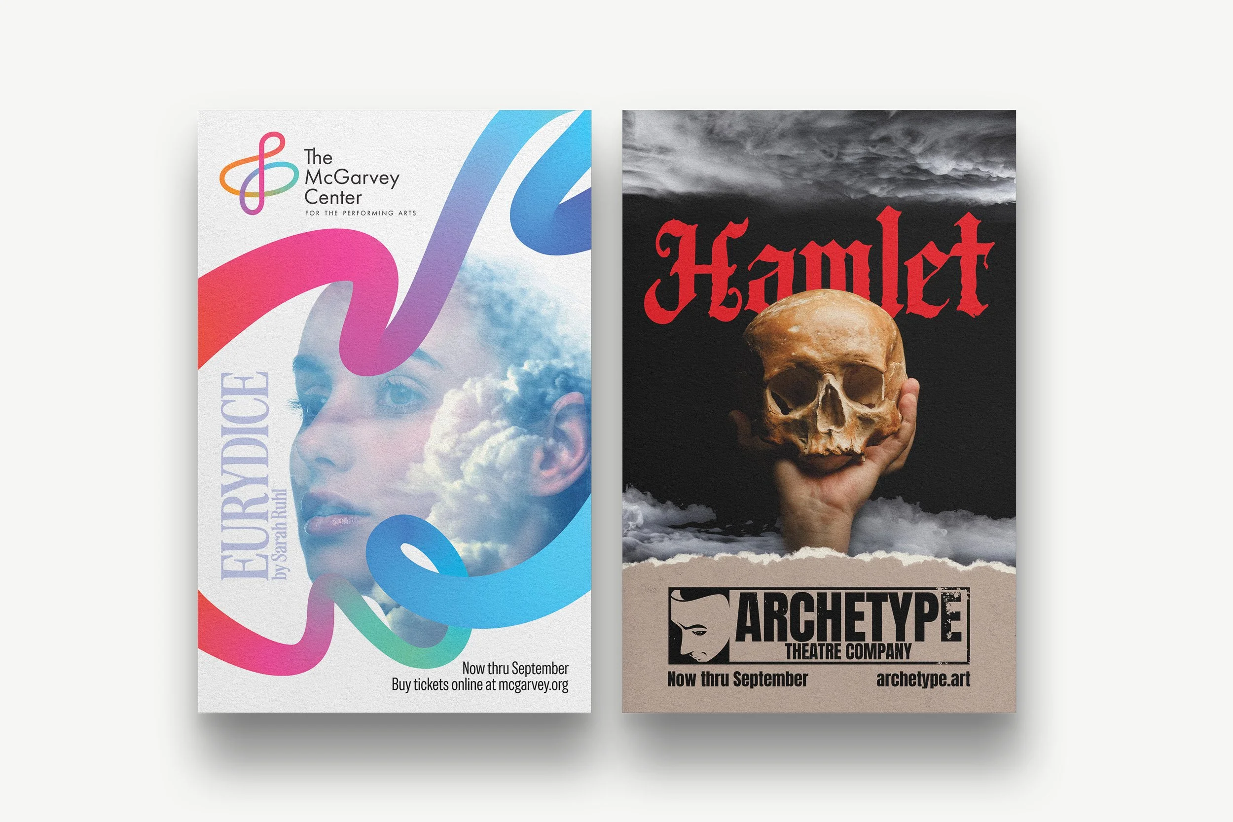
Examples of Cohesive Theatre Marketing. Notice the template used to distinguish the theater’s brand. Now, imagine a whole season of productions designed with that same template in mind for instant brand recognition, or to illustrate an overarching theme for the entire season.
Unique Theatre Marketing
Everyone wants to be unique, right? What does unique theatre marketing mean to me? It means there are no rules, no template to follow, no expectations for how your theatre posters are presented. This is going to be any graphic designer’s favorite type of theatre marketing. No rules can be very exciting to designers. Personally, I can go either way: you tell me what you want and I’ll get it done for you.
This approach creates many exciting opportunities to be creative with your presentation. Let’s say you’re doing Harold Pinter’s BETRAYAL, and you create a series of posters featuring portraits of each of the three actors (sorry, Waiter) involved in the love-triangle. Each portrait can present a different feeling, different situation based on their years-long affair.
If you’re doing the play TRIBES by Nina Raine, a play about a family dealing with blindness, you could incorporate braille.
Check out my advertising campaign for Stephen Sondheim’s musical masterpiece ASSASSINS, which featured numerous teaser posters leading up to the poster reveal. Click here to browse.
There are some “cons” with this approach. You gotta include some information: website, show dates and times, maybe an address?, who knows maybe a sponsor or two. However, because you’re taking the unique approach, that information can be worked into the design in a clever, creative way.
Also, some theatres prefer just having their logo, show dates, website and that’s it. And that’s OK.
Bottom line: Unique designs are eye-catching as hell. If you’ve established that you change your show poster’s looks with every production, existing patrons may look forward in anticipation to see what you’re going to come up with next. The challenge is how much information you include on the poster, and how it’s laid out. Again, that’s what I’m here for.
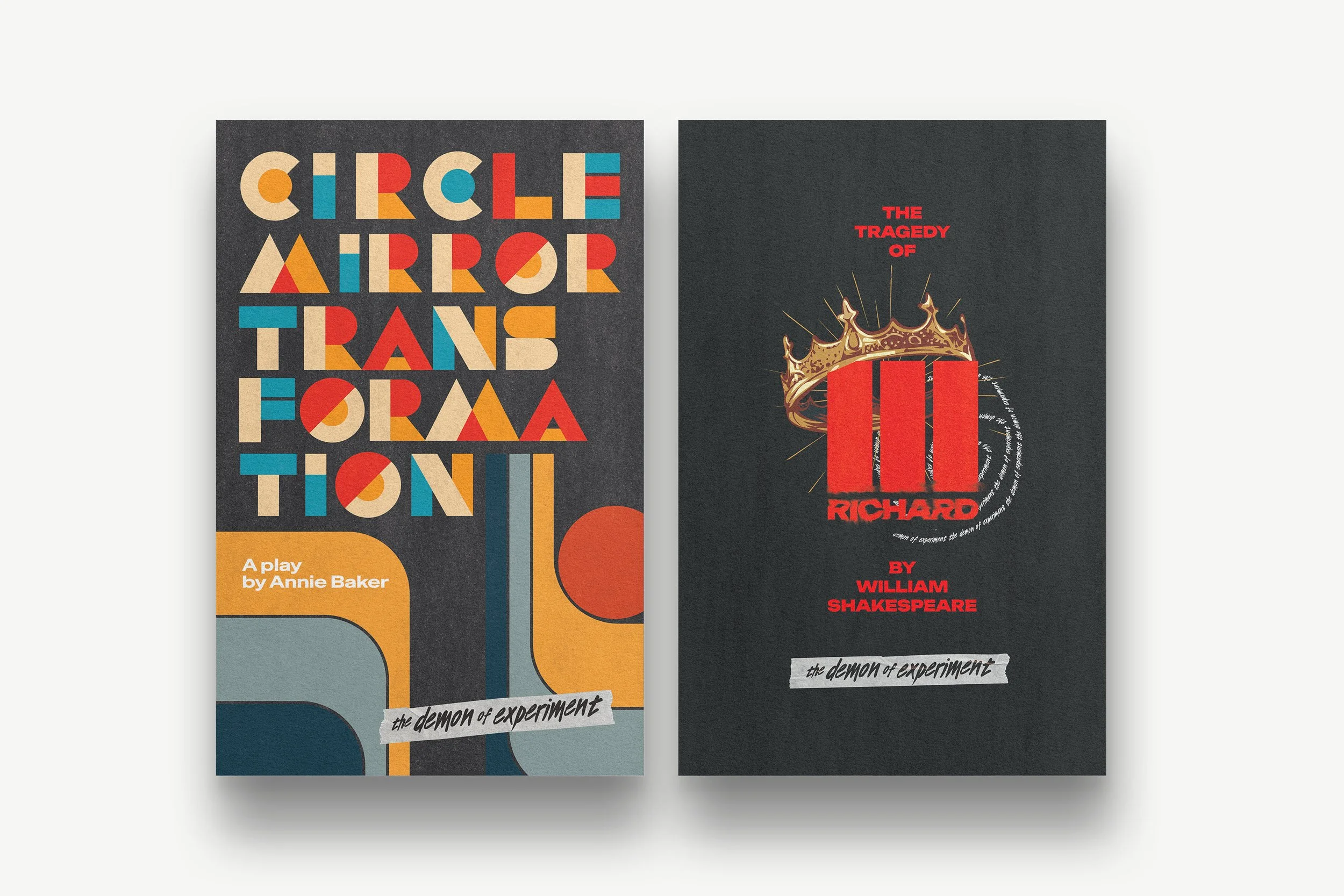
Examples of Unique Theatre Marketing. Notice how each poster is completely unique in it’s approach. Yes, some similar techniques were used, and the logo is the same, but you have vastly different key artwork representing each production. Thinking of it as creating a unique piece of art-vertising.
Uniform Theatre Marketing
A recent trend I have noticed with theatre companies of all sizes, especially well-established professional union houses, is that they will still display enticing imagery for their production posters, but they will design them in a strictly uniform manner. It almost reads as corporate to me.
On one hand, it’s good that you carry that recognition over from the COHESIVE approach. On the other hand, are you presenting the best poster artwork that tells a story and sells your show? If every show title is in the same sans-serif font without any sort of iconography or strong imagery, well, does that help sell your show to new audiences? It may not make a difference to season ticket holders, because they’re bought in no matter what. But theatre marketing is all about getting new audiences.
The “pro” here is that it does look incredibly professional and makes your theatre feel like a million bucks. Like a well-established venue in your city.
The “con,” in my opinion, is just that it can lack personality if it isn’t done very thoughtfully. I suppose if you go with me as your graphic designer, you can bet your bottom dollar that plenty of thought will be put into it. But still, I think it’s best to save the uniform theatre marketing for teaser promotions, season announcements, cast announcements, audition announcements, etc.
Let the uniform theatre marketing posts build anticipation for the “official” artwork, which would likely then be of the COHESIVE variety.
Bottom line: Uniform theatre marketing achieves the same kind of instant recognition that COHESIVE does, but in a much more minimal, sometimes corporate manner. My personal opinion is that this approach is best saved for teasers. When you announce your season, but don’t have the time to dedicate to figuring out the official show artwork yet, you fall back on this uniform approach to get the show titles out there.
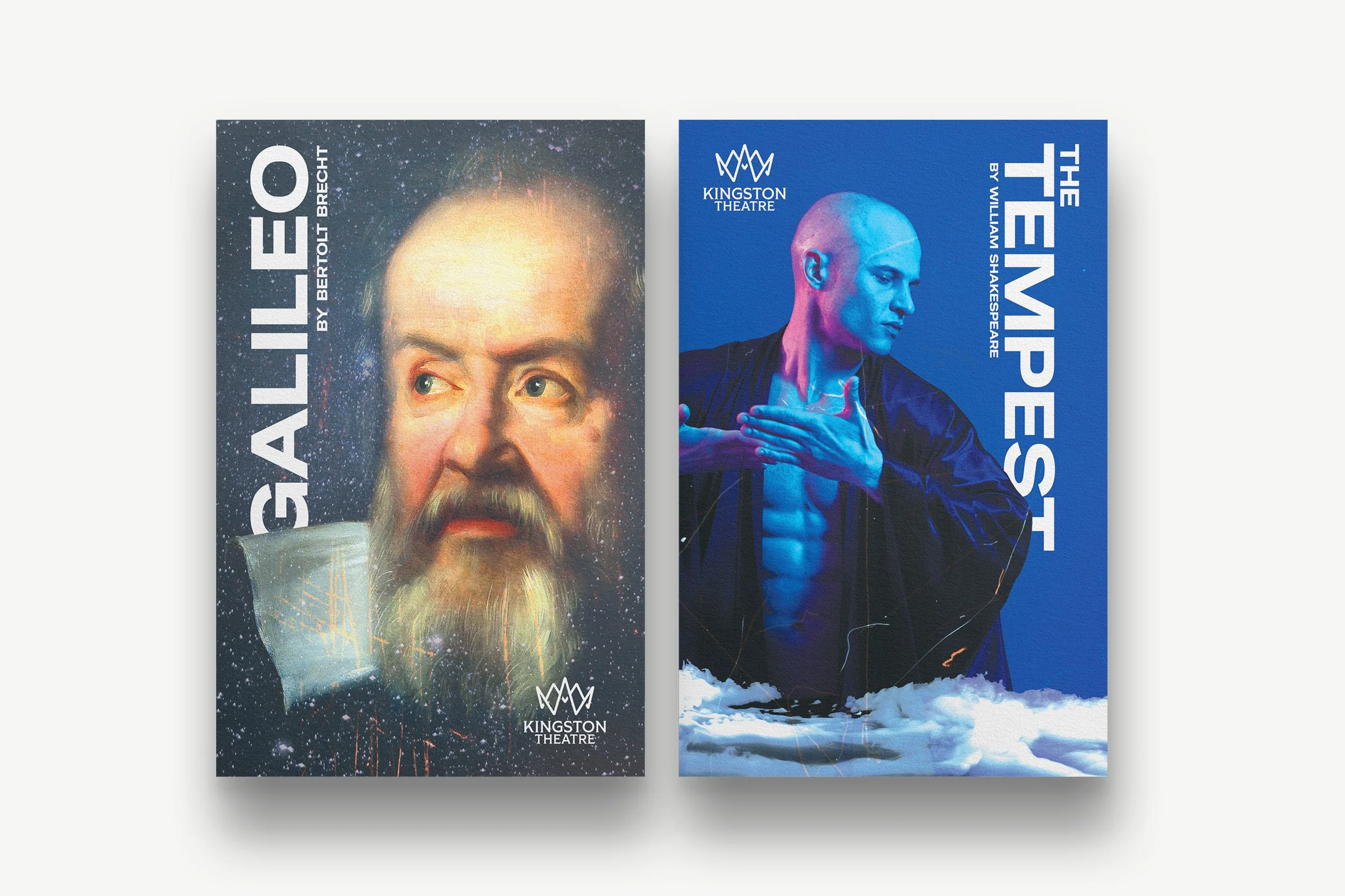
Examples of Uniform Theatre Marketing. Notice that the text treatment, logo placement, and central image are all treated consistently. This is very similar to Cohesive Theatre Marketing, but without the template that ties into the season and/or theatre’s brand.
In Conclusion…
These are just three approaches out of dozens. And the only wrong answer is to not care about the artistic quality of your theatre posters (or use AI). So whatever you end up choosing or experimenting with, do it with confidence, because you’re already ahead of the curve of a lot of theaters out there who don’t put as much value in theater marketing.
And again, this is just the ramblings of some theatre graphic designer from the Midwest— what do I know?
You do you, embrace it, and commit to it 100%. With whatever you do in theatre marketing, just promise me one thing, okay? Don’t do it as if you were half-pregnant. ‘Cause you can’t be half-pregnant.
Thanks for attending my TED-Talk.